Build a 3D Site Without Code with Framer – Design+Code
May 30, 2026
Description
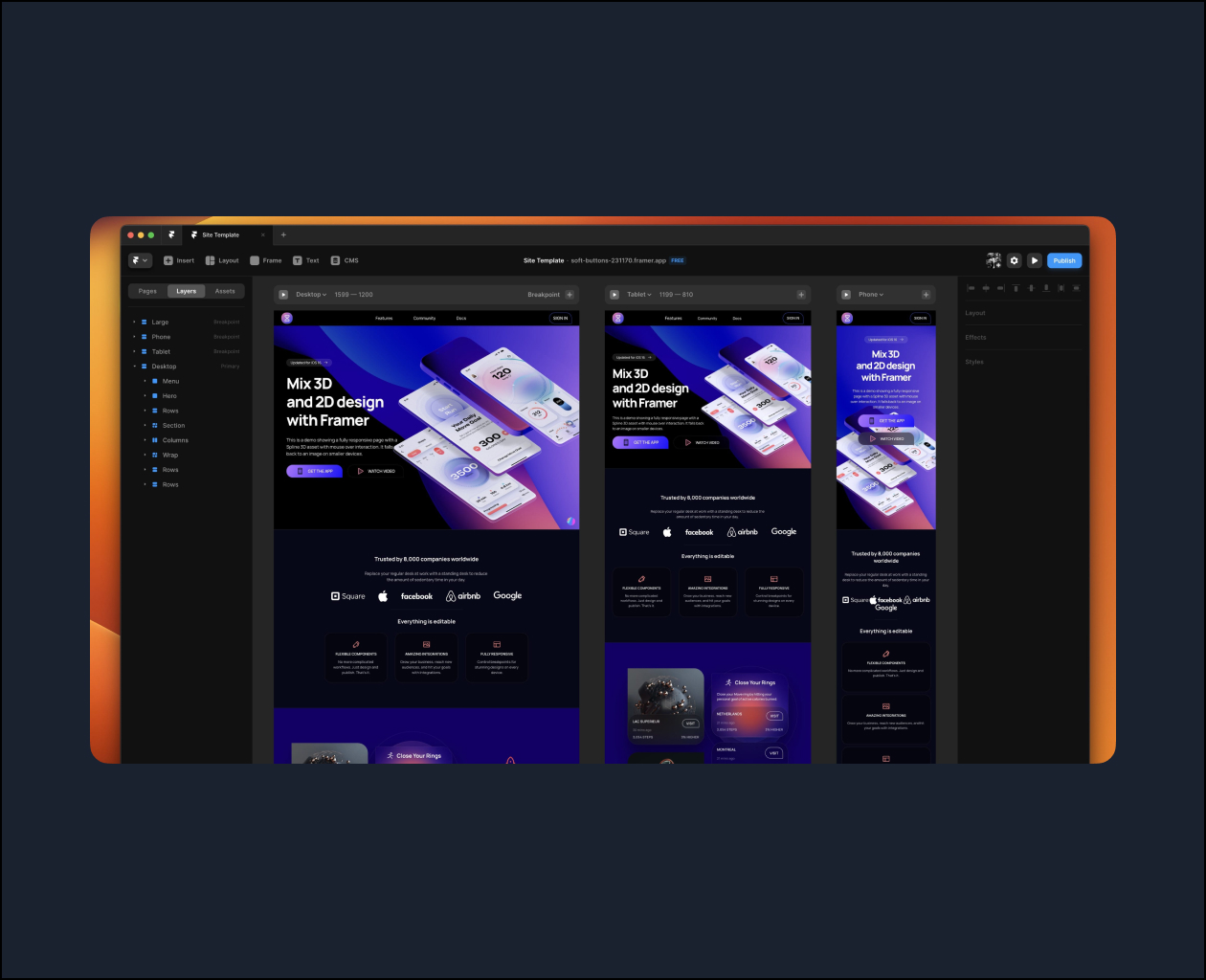
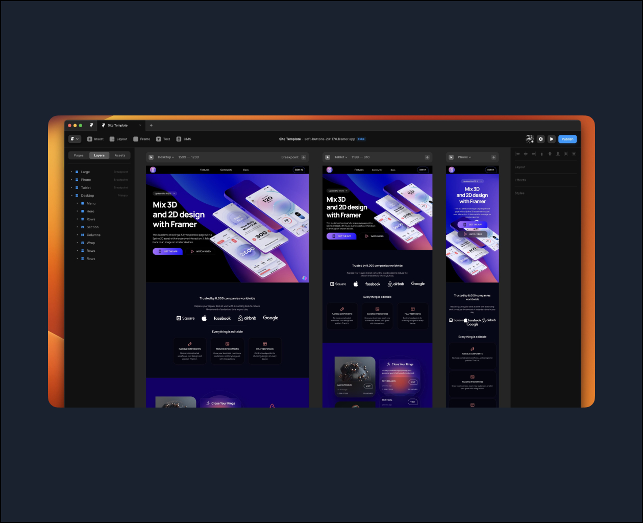
This course is entirely free thanks to Framer’s sponsorship. We’re going to build a multi-page site with 3D assets, animations and CMS data without touching code. It’s fully responsive and everything can be easily edited to turn it into a customized site.
Layout Stack
Every container in your layout can adapt to the size of your content. Similar to Flex in CSS and Stacks in SwiftUI, you can add content and adjust the direction, distribution, alignment and gap.
Breakpoints
Like Media Queries in CSS, you can set conditions based on the screen width. For example, elements can be hidden or fonts can be smaller on mobile devices. The same useful concepts of min width, max width, fraction and percentage units work great in Framer.
Embed 3D and Animated Assets
Framer has an incredibly useful Embed feature that lets you instantly embed element from a URL, like Spline 3D assets, Rive animated assets or simply YouTube videos.
Topics: UX/UI